

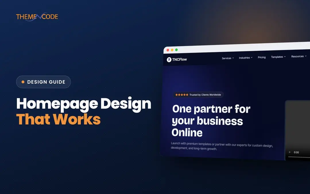
Good homepage design answers three questions within seconds: what is this, is it for me, and what should I do next. Everything below that first screen exists to build enough confidence for the visitor to take that next step. Each section has to earn the scroll by answering the next question a visitor is likely to have.
Most weak homepages fail for the same reasons. They open with a vague slogan, stack sections because other sites have them, and bury the one action that matters. This guide covers the sections worth including, the order that works for most businesses, what belongs above the fold and the mistakes to avoid.
Quick answer: A strong homepage starts with a clear headline, one-line explanation and a primary call to action, followed by proof, the problems you solve, what you offer, how it works, deeper proof such as case studies or testimonials, answers to common objections and a final call to action. Cut any section that does not help a visitor decide.
What a homepage is actually for
A homepage is not a summary of everything you do. It is a routing and persuasion page. Some visitors arrive knowing exactly what they want and need the fastest path to it. Others are comparing you with competitors and need reasons to trust you. A few are just curious. Good homepage design serves the first group immediately and gives the second group a logical story to scroll through.
That is why the order of sections matters more than the number. Each section should answer the question the previous one raised.
Above the fold: the first screen
The area visible before scrolling, often called above the fold, gets the most attention. It needs to do four jobs:
- A specific headline. Say what you do and for whom. “Bookkeeping for independent restaurants” beats “Your success, simplified”.
- One supporting line. Add the key benefit or how you are different, in plain language.
- A primary call to action. One clear button, such as “Book a call”, “Start free” or “Shop the collection”. A secondary, lower-commitment link is fine.
- A relevant visual. A product screenshot, the actual product or real work. Stock photos of smiling people at laptops add little.
Keep the navigation simple and the header uncluttered so the headline and call to action stand out. On mobile, check that the headline and button are visible without scrolling and that a large image is not pushing them down.
The homepage sections that earn the scroll
Here are the website homepage sections that do real work, in the order that suits most service businesses, SaaS products and agencies. Online stores follow a slightly different pattern, covered below.
1. Hero
Headline, supporting line, primary call to action and visual, as above. This is the only section every homepage needs.
2. Quick proof
A strip of client logos, a review rating, a short line like “Trusted by 200+ clinics” (only if true) or a press mention. This answers “Is this legitimate?” before the visitor commits to reading more.
3. The problem you solve
Describe the situation your customer is in, using their language. Two or three short points are enough. Visitors who recognize their problem keep reading.
4. What you offer
Your main products, services or features as clear cards or blocks, each with a short benefit-focused description and a link to its own page. Limit it to the three to six that matter most; link to the rest.
5. How it works
Three or four simple steps from first contact to result. This lowers the perceived effort and risk of getting started, especially for services.
6. Deeper proof
Testimonials with names and context, short case studies with real outcomes, or examples of your work. Specific beats generic: “Cut our quote turnaround from two days to two hours” is more convincing than “Great service”.
7. Objections and FAQs
Answer the questions that stop people from acting: pricing approach, timelines, contracts, support, compatibility. A short FAQ helps visitors and also gives search engines and AI tools clear answers to quote.
8. Final call to action
Repeat the main action with a short reason to take it now. Visitors who scrolled this far are interested; do not make them scroll back to the top.
9. Footer
Navigation, contact details, legal links and secondary routes for visitors who did not find what they needed above.
Homepage layout by business type
The core pattern stays the same, but the emphasis changes depending on what you sell.
| Business type | Hero focus | Most important sections | Primary call to action |
|---|---|---|---|
| Service business or agency | Outcome for a specific client type | Services, case studies, process, testimonials | Book a call or request a quote |
| SaaS or app | The core job the product does | Product screenshots, features, integrations, pricing teaser | Start free trial or get a demo |
| Online store | Current collection or bestsellers | Categories, featured products, reviews, shipping and returns | Shop now |
| Local business | Service plus location | Services, reviews, hours, map, booking | Call, book or get directions |
| Personal brand or creator | Who you are and who you help | Work samples, offers, newsletter | Subscribe or work with me |
For online stores, shoppers often want to browse straight away, so categories and products move higher, and proof shifts to reviews, delivery information and returns policy.
Homepage best practices for layout and visuals
- One idea per section. Each block should make a single point with a clear heading. Readers scan headings first.
- Consistent visual rhythm. Use a spacing system and limited type sizes so sections feel related.
- Contrast for actions. Make buttons visually distinct and use the same style for the same action throughout.
- Real images over decoration. Show your product, your team and your work.
- Short copy. Two or three lines per block on the homepage; link to detail pages for more.
- Fast loading. Compress images, avoid autoplay video backgrounds where possible and limit third-party scripts. Google’s Core Web Vitals guidance on web.dev explains which speed metrics matter most.
- Accessible by default. Sufficient color contrast, readable font sizes, descriptive link text and alt text for meaningful images.
Common homepage design mistakes
- Vague headlines. Clever slogans that do not say what you do force visitors to work it out.
- Sliders and carousels in the hero. Most visitors see only the first slide, and rotating messages dilute focus.
- Too many calls to action. When every section has a different button, none of them stands out.
- Talking about yourself first. Company history and mission statements matter less to new visitors than their own problem.
- Generic proof. Anonymous testimonials and unverifiable claims weaken trust instead of building it.
- Ignoring mobile. Most homepages get a large share of mobile traffic. Long text blocks and tiny buttons hurt most there.
- Section bloat. Adding blocks because a competitor has them. If a section does not answer a visitor question, cut it.
How to plan a homepage redesign
A redesign goes faster and works better when you plan the content before the visuals.
- Define the primary visitor and action. Who is the homepage mainly for, and what is the single most valuable thing they can do?
- List their questions in order. What would they ask, from “What is this?” to “How do I start?”
- Map one section to each question. This becomes your wireframe.
- Write the copy first. Headlines and short descriptions for each section, before choosing layouts.
- Gather real proof. Logos, testimonials, numbers and screenshots you can actually use.
- Design, then test on a phone. Check the first screen, button visibility and load speed on a real device.
- Measure after launch. Watch scroll depth, clicks on the main call to action and conversions, then adjust.
Templates or custom design?
If your budget or timeline is tight, a well-built template gives you a proven homepage layout, consistent components and responsive behavior out of the box. You replace the content, adjust colors and type, and remove sections you do not need. TNCFlow offers Webflow templates, Framer templates and Astro, HTML and Figma options you can adapt instead of starting from a blank page.
A custom design makes sense when your offer is complex, your brand needs to stand apart or conversion is critical enough to justify research and testing. TNCFlow’s UI/UX design service starts from visitor questions and content, then designs the homepage around them.
Homepage design checklist
- The headline says what you do and for whom.
- One primary call to action is visible on the first screen, on desktop and mobile.
- Quick proof appears near the top.
- Each section answers one visitor question, in a logical order.
- Offers link to detailed pages.
- Testimonials and case studies are specific and attributed.
- Common objections are answered.
- A final call to action closes the page.
- Images are compressed and the page loads quickly.
- Text, buttons and contrast are accessible.
Frequently asked questions
What should be on a homepage?
A clear headline, a short explanation, a primary call to action, proof such as logos or reviews, your main offers, how it works, testimonials or case studies, answers to common questions and a final call to action.
How long should a homepage be?
Long enough to answer the questions a visitor needs answered before acting, and no longer. For most businesses that means six to nine focused sections, each short and scannable.
What does above the fold mean in web design?
It is the part of the page visible before scrolling. It should hold your headline, a supporting line, the primary call to action and a relevant visual.
Should I use a slider on my homepage?
Usually not. Most visitors only see the first slide, and rotating messages split attention. A single strong hero message with one clear action generally works better.
How often should I redesign my homepage?
There is no fixed schedule. Update the homepage when your offer, audience or brand changes, or when analytics show visitors are not clicking your main call to action. Small, regular improvements often beat occasional full redesigns.